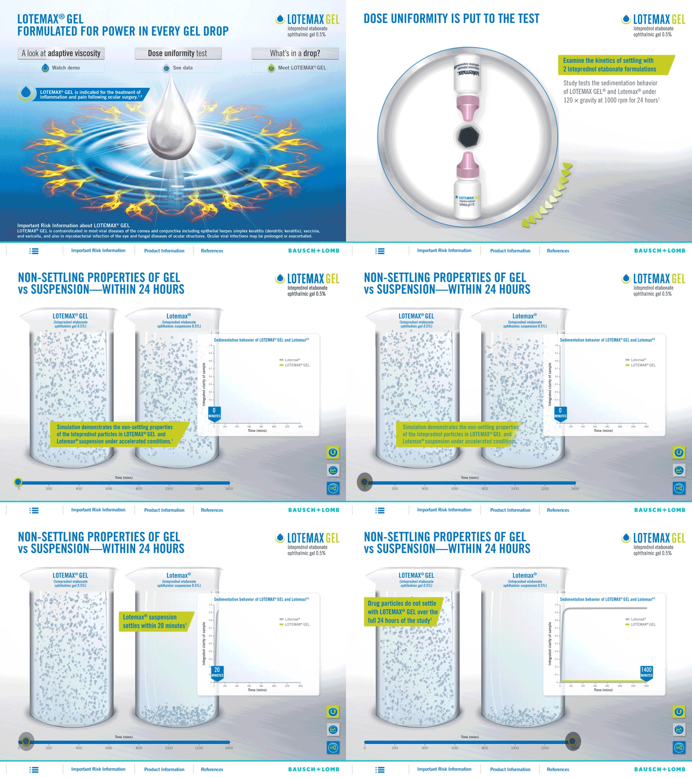

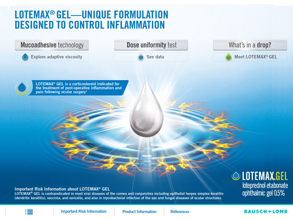
Problem: In the past, presenters would actually drip the new and old gel on a slide and tilt it to show the new gel higher viscosity. The problem was to showcase this property and how it extended to many other advantages when using the product.
Solution: Our team decided to: 1. Design a digital drip test that mimics showing the density of the product on glass at an angle. 2. A touch/drag test to show the viscosity advantage between the old and new product. 3. A centrifuge simulation showing the distillation properties in a liquid.
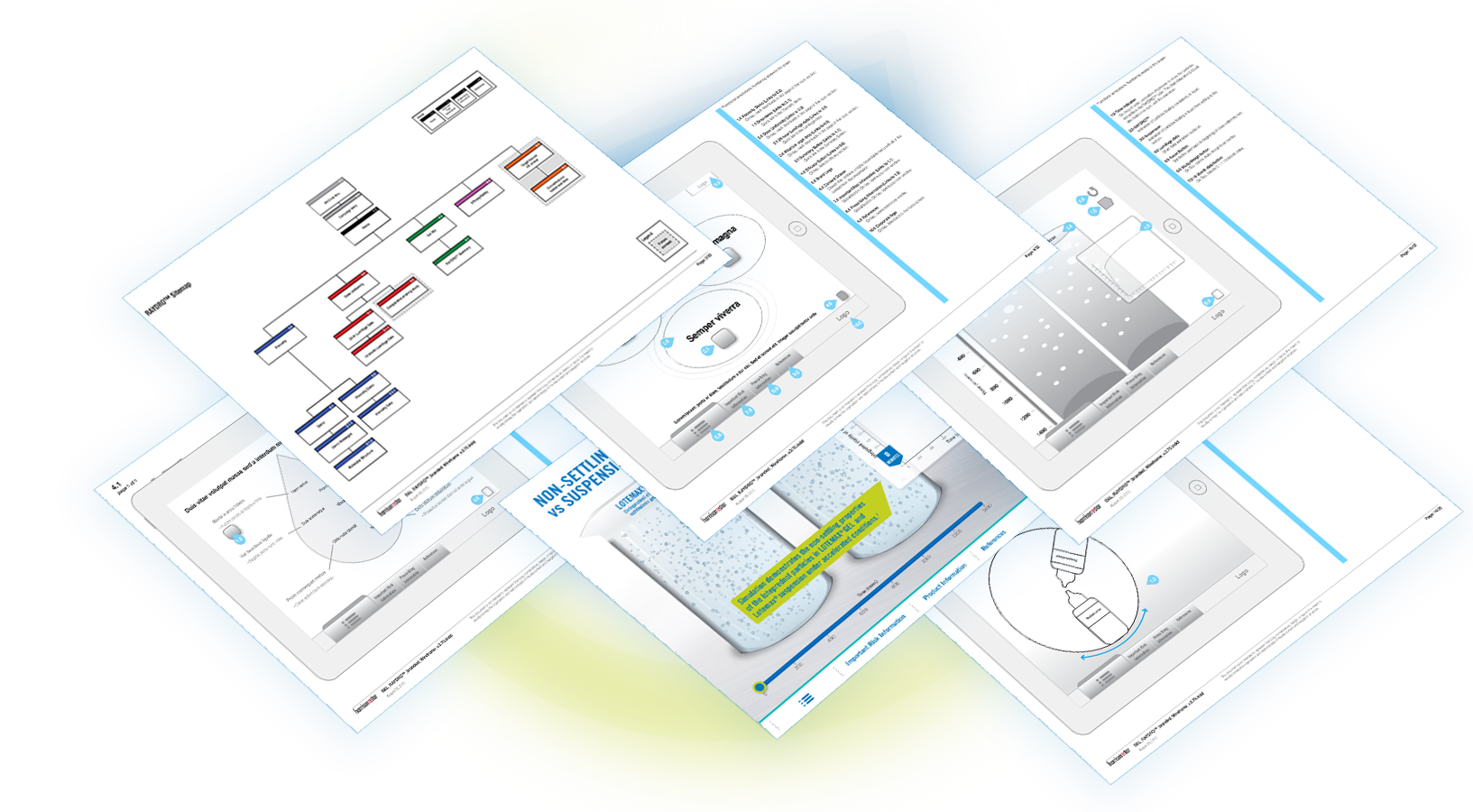
Albert produced the UX design and wireframes.
View the wireframes for Lotemax Gel.
A simulation of the working app was done for the client.
View the iPad Simulation.
View the pdf of wireframes for Lotemax Gel.

In the past, presenters would actually drip the new and old gel on a slide and tilt it to show the new gel higher viscosity.
The team decided to design a digital drip test that mimics showing the density of the product on a glass slide at an angle. The need for a physical example was eliminated except in the case of extreme examples. The sales representatives loved using this feature. So much neater and faster.
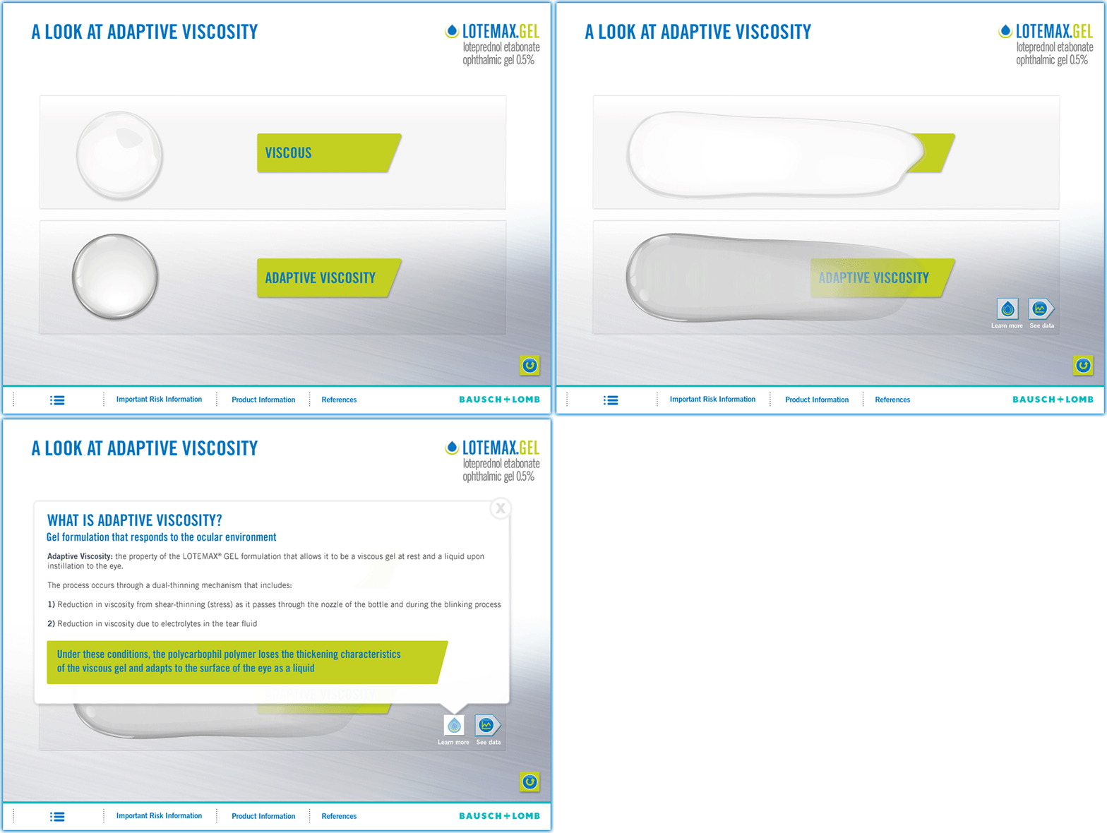
To further illustrate the new gel higher viscosity advantage.
A touch/drag test to show the viscosity advantage between the old and new product. As a user dragged their finger across the screen, the substance would lag behind showing the higher density of the product.

A centrifuge simulation showing the distillation properties in a liquid was designed. The user would spin the centrifuge to advance to the next screen.
The simple centrifuge animation leads to a screen showing the behavior of the new solution in a beaker that illustrates the gels ability to maintain density over the previous product.
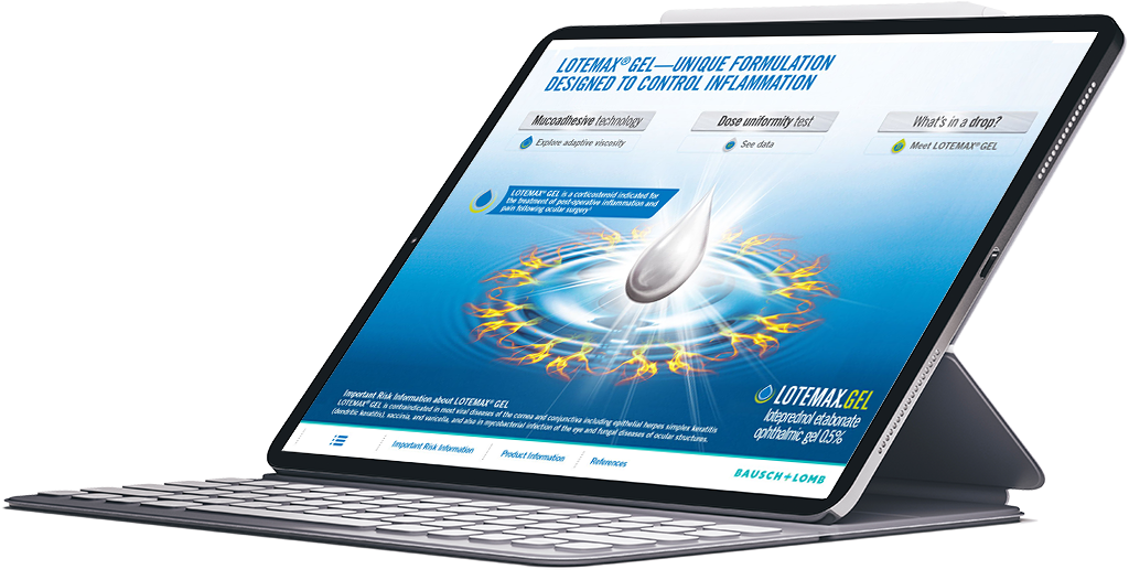
A simulation of the working app was done for the client.
View the full video animation here iPad Simulation.
