UX Design    •    UI Design    •    Digital Art Director

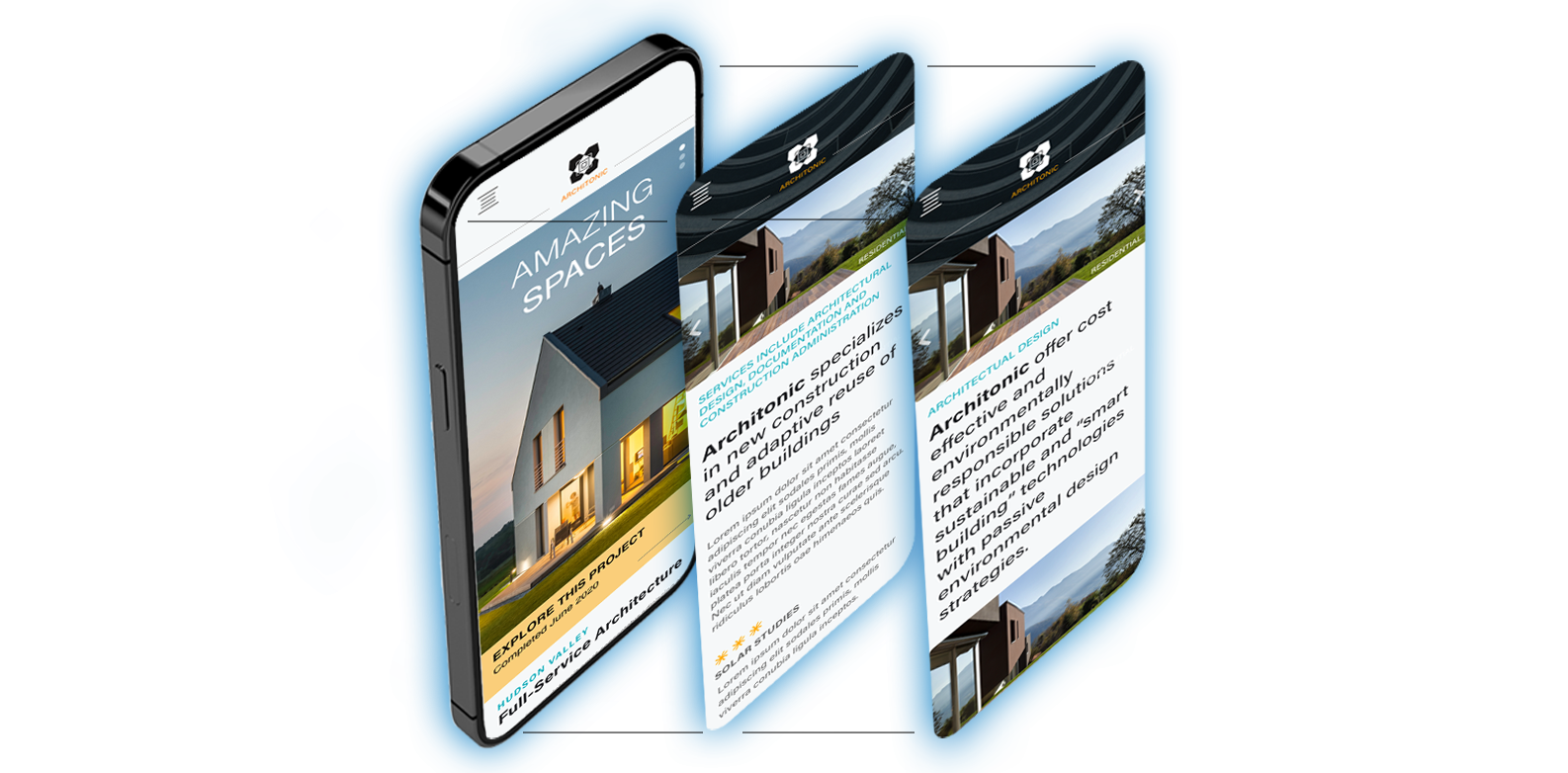
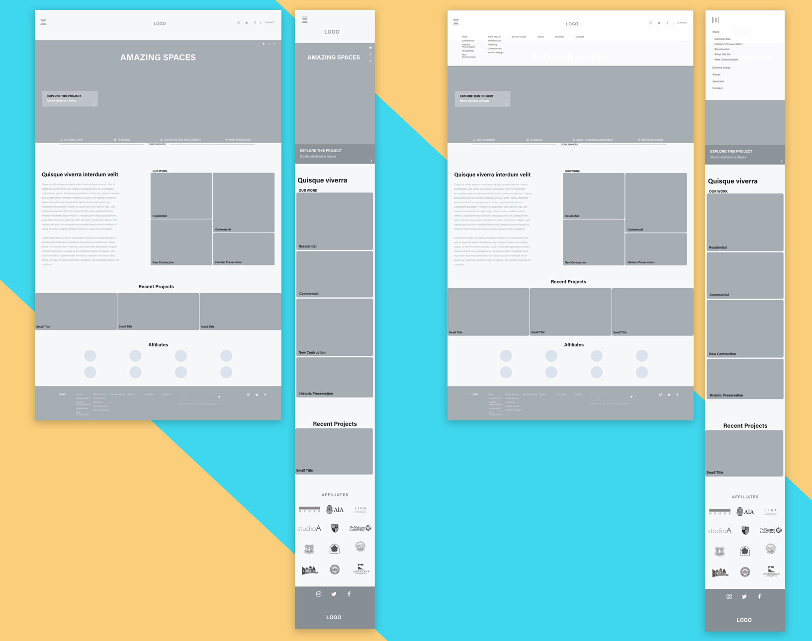
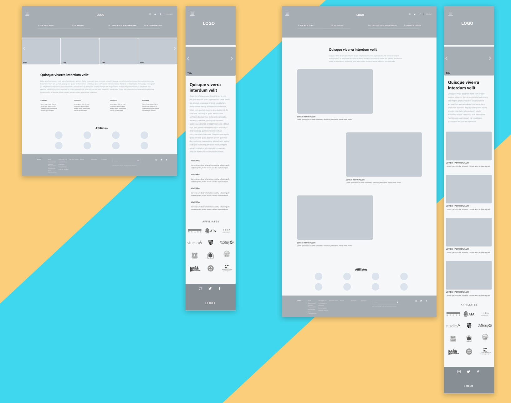
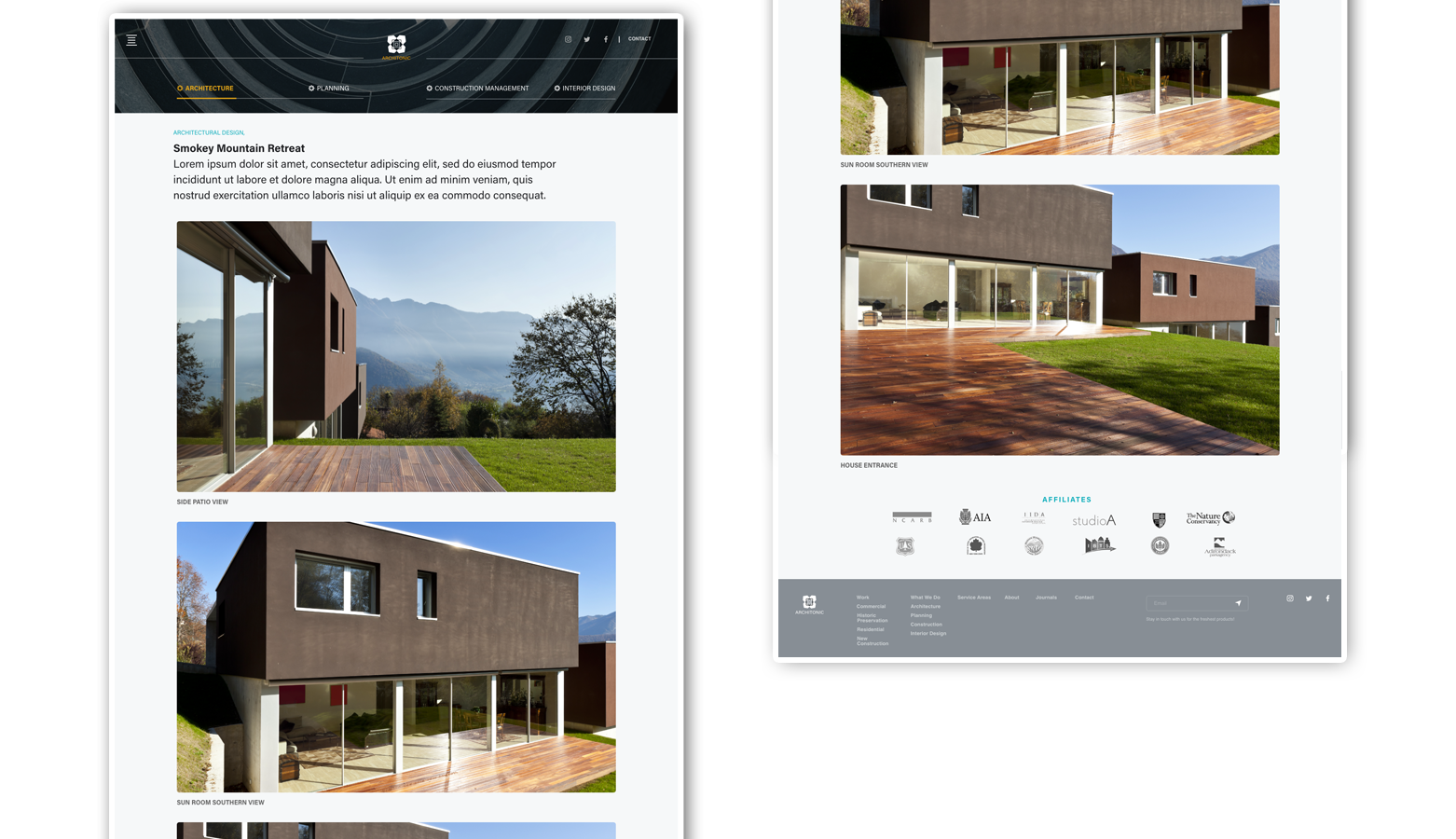
Architonic Architecture Responsive Web Site

The problem: An architecture site with a dated navigation and design needed a refreshed look.

A UX checklist and heuristic analysis were performed on the client web site. The analytics were reviewed and a quick chart that showed the bounce rate was developed. The data gathered from these explorations enabled us to design a plan for the redesign of the web site.

Wireframes were created to better guide the user to projects. A flatter site structure was created.
responsive priview
Wireframes were designed to enable a minimum number of clicks to projects due to site analytics pointing to project pages as being the most sticky after the firm description.

The data pointed to the about page as the most popular page which is a common result but users were not finding a clear path to projects due to an over broad classification system. We reduced the groupings to four main sections.

The next step was to design a style guide to start the comps using the wires as a starting point.
Initial comps were designed and the iterative process began.
Home screen showing drop down menu.
Landing screen for the services offered by firm. Also showing navigation for project headings.
User has selected a section and this page lists the actions initiated within the Architecture heading along with links to sub sections within Architecture.
On the right is a sub section page with specific projects to view.
Project page showing the full history of the project including site description and location.